Level up your customer segments - Customer Segmentation Analytics in Action (Part-2)
Customer Segmentation Analytics in Action
In Part 1, we talked about why businesses prioritize Customer Segmentation Analysis to drive revenue growth and brand loyalty; we explored the benefits of conducting segmentation to better understand our customers, and best-practices to get viable results.
We also discussed in brief on different segmentation techniques such as– how Rule-Based Segmentation is useful on static data, vs. how we can deal with changing customer behaviors over time with Dynamic customer segmentation methods.
But how can we really implement these techniques in real-time? How do we segment our customers based on the data we collect from them?
This is exactly why we have created Part 2 for this series, with live examples and re-usable code, to witness Customer Segmentation in Action.
We have created examples to cover K-Means Clustering Segmentation and RFM Segmentation with results that truly reveal the impact these techniques can have on businesses, in terms of insights drawn and customer trends realized.
In this section, we are going to work with an example dataset we are considering for our use case - SuperMarket Sales from a store
This dataset consists of unique Invoice IDs related to each purchase, along with Customer details against it such as Age, Gender, Store Branch, City, Product Line etc.
Dynamic Segmentation using K-Means clustering algo.
K-Means Clustering works by iteratively assigning data points to clusters and updating the cluster centroids until an optimal solution is reached. In the context of customer segmentation, this means grouping customers based on similarities in their behavior, preferences, or demographics.
This technique is particularly valuable when dealing with large and complex datasets, as it can uncover hidden patterns and insights that might not be apparent through traditional analysis methods. By applying K-Means Clustering, businesses can gain a deeper understanding of their customer base, make data-driven decisions, and ultimately improve customer satisfaction and loyalty. So let’s dive right in and understand more about this customer base.
- To start with, we will be importing all required Python libraries and loading the dataset into Jupyter notebooks, as shown in this Colab notebook here.
Snapshot of resulting dataset can be seen below:
import numpy as np
import pandas as pd
import datetime
import matplotlib
import matplotlib.pyplot as plt
from matplotlib import colors
import seaborn as sns
from sklearn.preprocessing import LabelEncoder
from sklearn.preprocessing import StandardScaler
from sklearn.decomposition import PCA
from yellowbrick.cluster import KElbowVisualizer
from sklearn.cluster import KMeans
from mpl_toolkits.mplot3d import Axes3D
from sklearn.cluster import AgglomerativeClustering
from matplotlib.colors import ListedColormap
from sklearn import metrics
import warnings
import sys

if not sys.warnoptions:
    warnings.simplefilter("ignore")

np.random.seed(42)

import seaborn as sns
import math
from sklearn.cluster import KMeans
from sklearn.preprocessing import MinMaxScaler
from sklearn.neighbors import NearestNeighbors
from sklearn.cluster import DBSCAN
from sklearn.cluster import AgglomerativeClustering
from sklearn.metrics import silhouette_samples, silhouette_score

# Importing the data onto Jupyter
df = pd.read_csv('CSA_supermarket_sales.csv')
df.head(20)
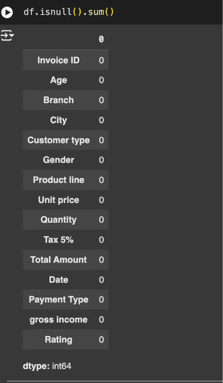
2. Viewing field details, normal stats and null values in the dataset
df.info()
df.describe()
df.isnull().sum()
# Calculate gender split
gender_counts = df['Gender'].value_counts(normalize=True) * 100

# Display
print("Gender Split (%):n")
print(gender_counts)
# Calculate Customer type split
ct_counts = df['Customer type'].value_counts(normalize=True) * 100

# Display
print("Customer type Split (%):n")
print(ct_counts)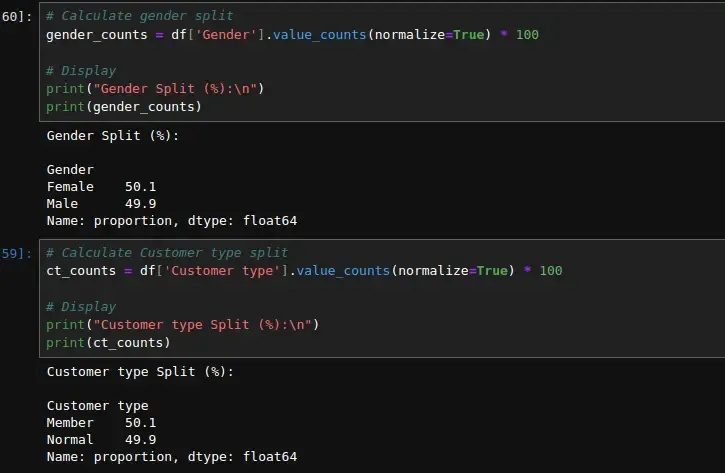
Initial Observations & Insights:
-
There are a total of 1000 order purchases made in this dataset.
-
The average age of customers is 44 years, with the minimum age being 18 yrs and maximum age being 70 years. The 75% percentile is 57 years, meaning more than 75% of the customers here are less than 57 years of age.
-
The average quantity of products purchased is 5-6 products, with a maximum of 10 products being purchased and minimum of 1 product purchased.
-
The average amount spent by customers is $322, with a maximum of $1042 spent and minimum of $10 spent on products.
-
The average rating provided by the customers is a 6.9 out of 10.
-
50% of the customers here are females, while 49% are males.
Data Analysis done on Dataset
- Checking distribution of data using Histograms- across Age, Total Amount spent on products and Customer Ratings.
# Create Histograms
plt.figure(figsize=(15, 5))

for i, col in enumerate([ 'Age', 'Total Amount', 'Rating']):
    plt.subplot(1, 3, i+1)
    sns.histplot(data=df, x=col, bins=15, kde=True, color='skyblue')
    plt.xlabel(col)

plt.suptitle('Distribution of Age(#), Total Amount($) & Rating(1 to 10)', fontsize=17, fontweight = 'bold', ha='center')
plt.subplots_adjust(wspace=0.2)

# Display
plt.show()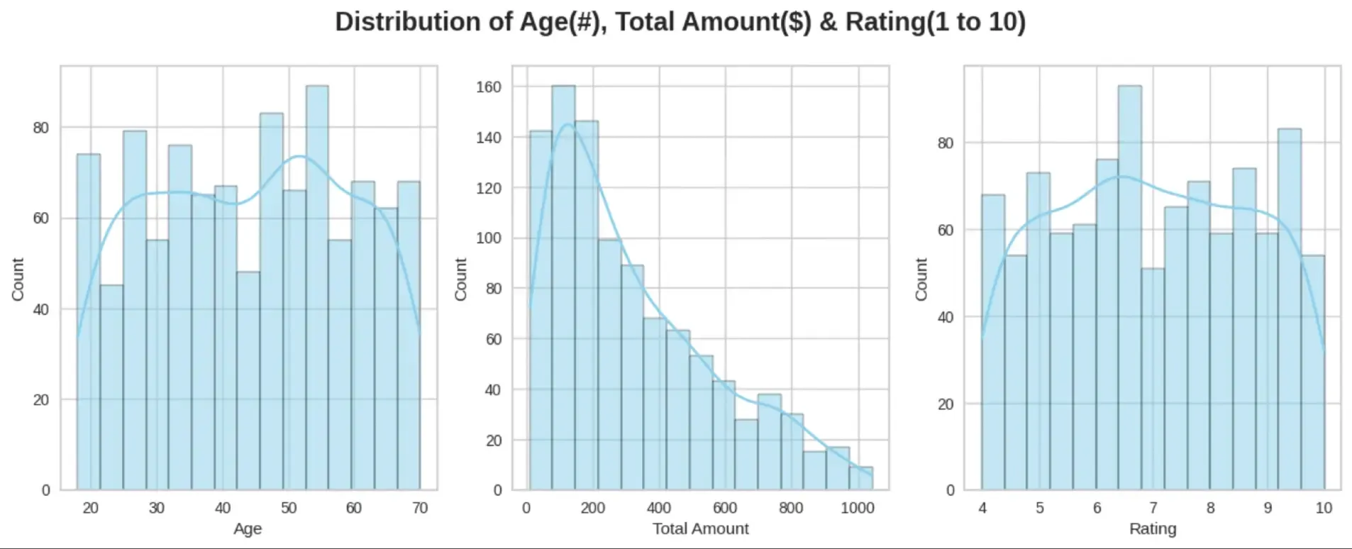
- Scatter plot to see initial spread of Amount spent across different age groups.
As per the plot, greater than 60% of the customers tend to spend less than 400 dollars on products across all age groups.
# Set style
sns.set_style('whitegrid')
plt.figure(figsize=(15, 6))

# Create Scatterplot
plt.figure(figsize=(15, 6))
sns.scatterplot(x='Age', y='Total Amount', data=df, hue='Gender', s=150, alpha=0.7)
plt.xlabel('Age')
plt.ylabel('Total Amnt Spent')
plt.title('Age v. Amount Scatterplot', fontsize=17, fontweight = 'bold')

# Display
plt.show()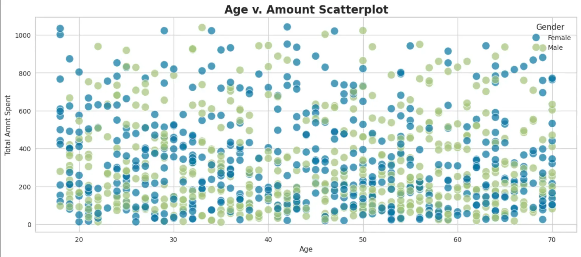
- Scatter plot to see Ratings given as per Amount spent
As per plot, mostly Females tend to spend on expensive products, while Males tend to spend within 800 USD.
# Set style
sns.set_style('whitegrid')
plt.figure(figsize=(15, 6))

# Create scatter plot of Annual Income and Age, colored by Gender
sns.scatterplot(data=df, x='Total Amount', y='Rating', hue='Gender',  s=160, alpha=0.8)

# Add title
plt.title('Amount_Spent vs. Rating Scatterplot', fontsize=17, fontweight='bold')

# Display
plt.show()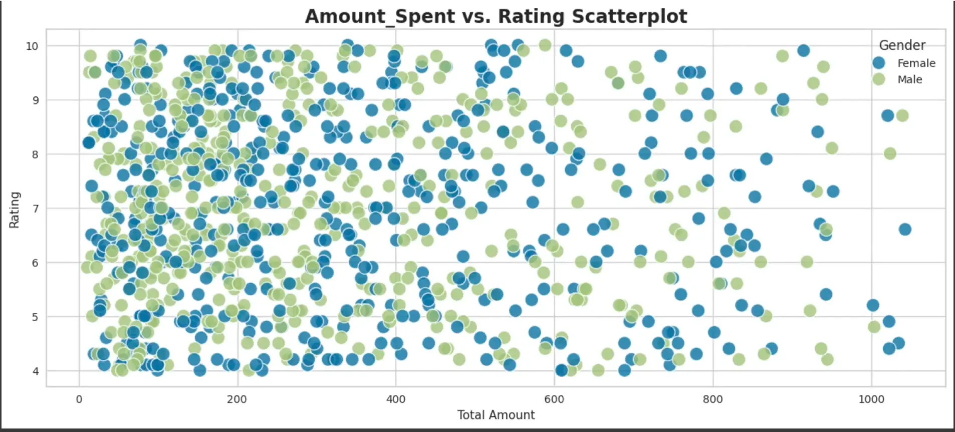
- Box plot to see distribution of amounts and spending - Mentions that mostly all customers spent in the range of 150 USD-450 USD on products, with a few outliers spending over $1000. Average customer ratings range from 5.5/10 - 8.5/10
# Set style
sns.set_style('whitegrid')
plt.figure(figsize=(15, 8))

# Create boxplots
plt.subplot(1, 2, 1)
sns.boxplot(y=df["Total Amount"])
plt.subplot(1, 2, 2)
sns.boxplot(y=df["Rating"], color='red')

# Add title
plt.suptitle('Amount_Spent v. Rating Distribution', fontsize=17, fontweight='bold', x=0.5)

# Display
plt.show()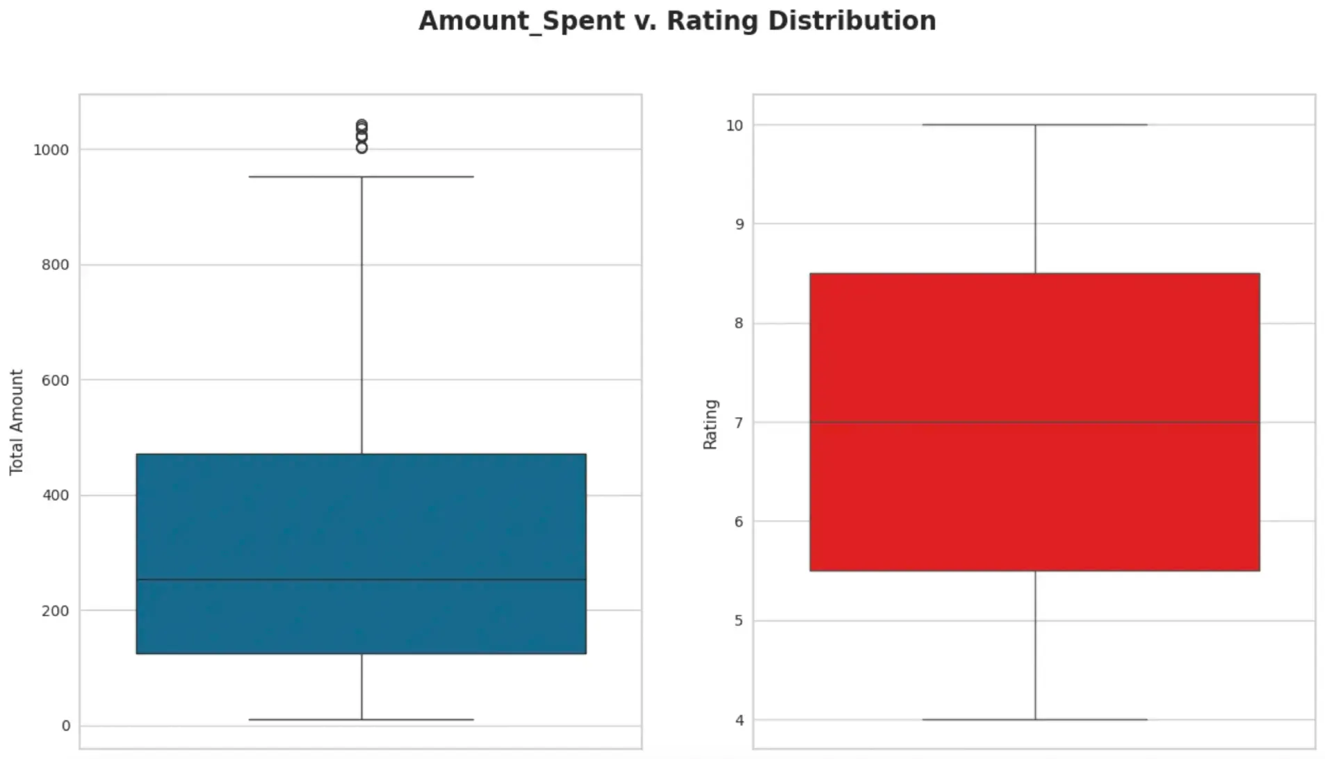
- Bar Chart to see distribution of amount spent - 90% of Customers spent in the range of 10 USD- 500 USD on products. With mostly Males spending on cheaper products <$200 and Females spending on expensive products >700 USD.
# Set style
sns.set_style('whitegrid')
plt.figure(figsize=(15, 6))

# Create Histogram
sns.histplot(data=df, x='Total Amount', hue='Gender', kde=True)

# Add title
plt.title('Amount Distribution', fontsize=17, fontweight='bold')

# Display
plt.show()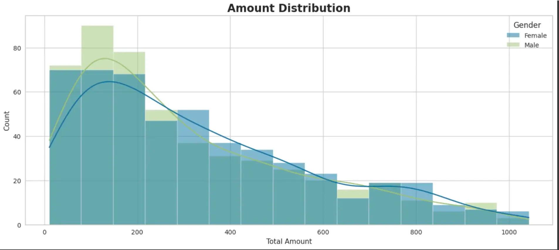
K-Means Cluster Creation
-
Deciding on Dimensions — Before we begin K-Means clustering, we will have to decide the dimensions we want to group our customers against. Depending on the specific priorities a business has, and the customer features to be looked into. We can pick the fields to be used in clustering and make sure they are relationally in sync.
-
Normalising Data- We will first have to normalize the data to make sure different measures are on the same scale to make meaningful comparisons. We will select all the measures to be normalized, and transform data points to lie on a scale ranging from zero to one. Code can be found here.
# Normalise data

# Select numerical columns to normalize
num_cols = ['Age', 'Total Amount', 'Rating']

# Initialise scaler
scaler = MinMaxScaler()

# Normalise
df[num_cols] = scaler.fit_transform(df[num_cols])
df.head(20)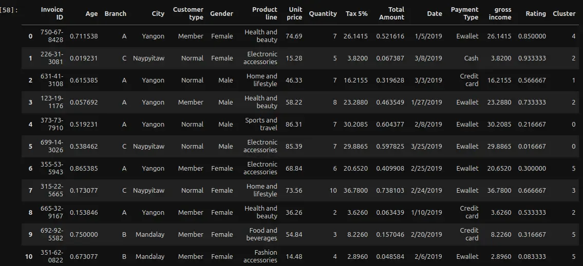
- Now we will have to determine the number of clusters/groups we can divide our customers into, for comparison across different dimensions. This is done using the Elbow Method. Resulting in the below Elbow plot.
# Create empty lists for WCSS values & their respective K Values
wcss_values = []
k_values = []

# Fit KMeans
for k in range(1, 11):
    kmeans = KMeans(n_clusters=k, init='random', random_state=42)
    kmeans.fit(df[['Age', 'Total Amount', 'Rating']])
    wcss_values.append(kmeans.inertia_)
    k_values.append(k)

# Plot Elbow plot
plt.figure(figsize=(7, 3))
plt.plot(k_values, wcss_values, 'bx-')
plt.xlabel('K')
plt.ylabel('WCSS')
plt.title('Elbow Plot using KMeans', fontsize=17, fontweight='bold')
plt.show()
# Also sense-checking using k-means++
# Determine optimal number of clusters
X = df[['Age', 'Total Amount', 'Rating']]
wcss = []
for i in range(1, 11):
kmeans = KMeans(n_clusters=i, init='k-means++', random_state=42)
kmeans.fit(X)
wcss.append(kmeans.inertia_)
# Plot WCSS values against number of clusters
plt.figure(figsize=(7, 3))
plt.plot(range(1, 11), wcss)
plt.title('Elbow Plot using K-Means++', fontsize=17, fontweight='bold')
plt.xlabel('Number of Clusters')
plt.ylabel('WCSS')
plt.show()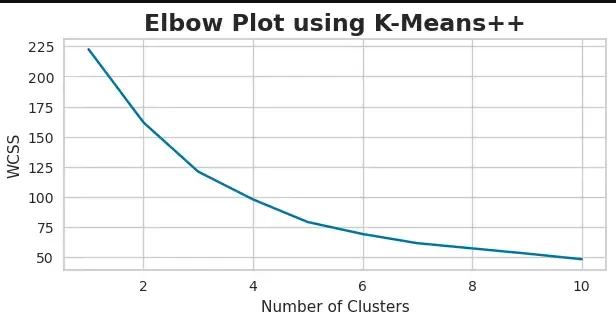
- We can see that after K=5/ K=6, the inertia drops. Hence, we can start with taking 5-6 clusters to create our customer groups/segments. Code can be found here.
Post creating 6 clusters, we can see 6 segments of customers created from the dataset numbered zero to five, on the scatter plot.
# Create k-means object - 6 clusters
kmeans = KMeans(n_clusters=6)

# Fit k-means object to the data
kmeans.fit(df[['Age', 'Total Amount', 'Rating']])

# Add cluster labels to original df
df['Cluster'] = kmeans.labels_

# Set style & figure size
sns.set_style('whitegrid')
plt.figure(figsize=(15, 8))

# Plot clusters
sns.scatterplot(x='Total Amount', y='Rating', data=df, hue='Cluster', palette='colorblind', alpha=0.9, s=140)

# Set title, axis labels & legend
plt.title('K-Means Clustering - Amount_Spent & Rating Scatterplot', fontsize=17, fontweight='bold')
plt.xlabel('Amount_Spent ($K)')
plt.ylabel('Rating(*10)')
plt.legend(loc='center left', bbox_to_anchor=(1, 0.5))

# Display
plt.show()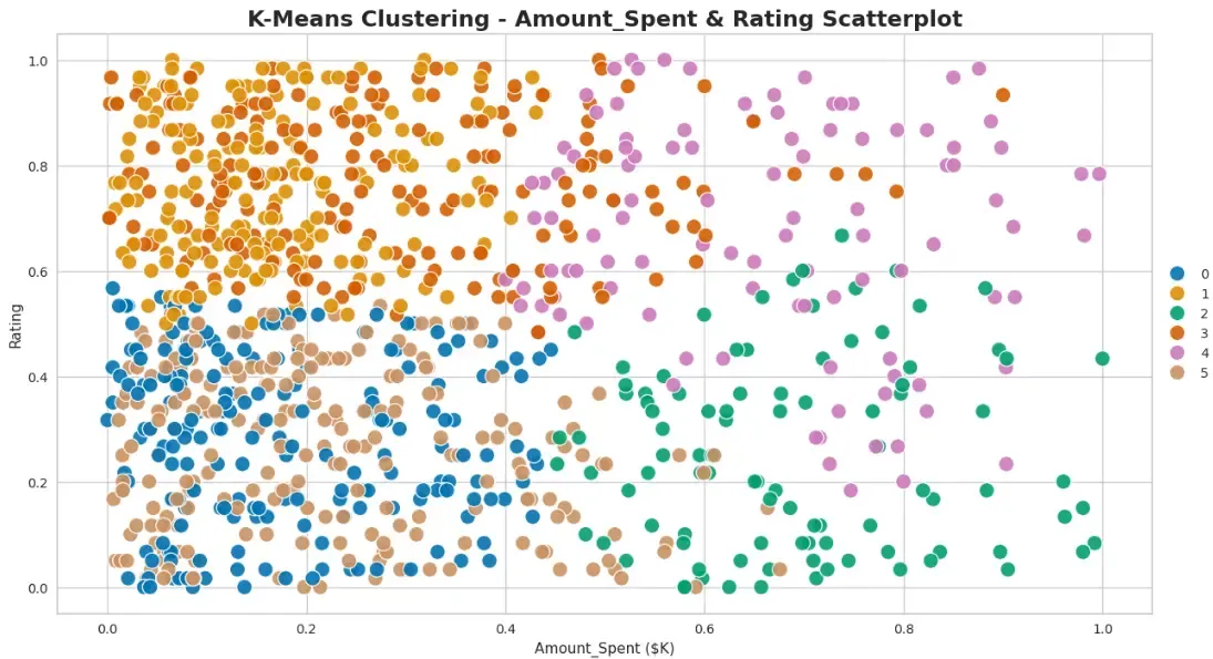
- Adding Age as well and creating final K-Means Cluster plot for Segmentation — we can see a 3-D scatter plot created with all the clusters grouped based on customers’ similarities. These clusters can be measured against the scale of dimensions chosen. Code can be found here
# Create k-means object - 6 clusters
kmeans = KMeans(n_clusters = 6)

# Fit k-means object to the data
kmeans.fit(df[['Age', 'Total Amount', 'Rating']])

# Add cluster labels to original df
df['Cluster'] = kmeans.labels_

# Set style
sns.set_style('whitegrid')
fig = plt.figure(figsize=(12, 9))

# Create custom colormap
my_cmap = plt.cm.get_cmap('viridis', 6)

# Create 3D scatter plot
ax = fig.add_subplot(111, projection='3d')
scatter = ax.scatter(df['Age'], df['Total Amount'], df['Rating'], c=df['Cluster'], s=130, cmap=my_cmap)

# Add legend
legend1 = ax.legend(*scatter.legend_elements(),
                    loc="lower left", title="Cluster")
ax.add_artist(legend1)

# Set the colorbar to show cluster labels
cbar = plt.colorbar(scatter)
cbar.set_ticks(np.arange(0, 6))
cbar.set_ticklabels(['Cluster 1', 'Cluster 2', 'Cluster 3', 'Cluster 4', 'Cluster 5', 'Cluster 6'])

# Set axis labels and title
ax.set_xlabel('Age')
ax.set_ylabel('Total Amount')
ax.set_zlabel('Rating')
ax.set_title('K-Means Clustering - Age, Amount_Spent & Rating', fontsize=17, fontweight='bold')

# Plot centroids
centroids = kmeans.cluster_centers_
ax.scatter(centroids[:, 0], centroids[:, 1], centroids[:, 2], marker='x', s=300, linewidths=3, color='black', zorder=10)

# Display
plt.show()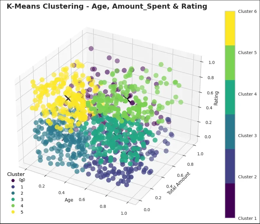
K-Means Customer Segmentation- Clustering Observations
From the above graph, we can see that 6 clusters are created which are grouped against 3 dimensions taken - Age, Rating, Total Amount Spent.
-
Using the Elbow method, we determined that the appropriate number of clusters to consider was K=6.
-
Post that, we added 3 dimensions against which we wanted to create customer segments - Age, Rating, Total Amount spent.
-
Cluster 5 (light green) — On the above plot, we see that Cluster 5 (light green) is a valuable segment as they have spent the maximum amount of money on products (in the range of $800-$1000) and also have given high ratings to bought items. They also tend to be the older generation in the age group of 45 yrs-70 yrs.
-
Cluster 6 (yellow) — this segment of customers are also high spenders who bought expensive items (in the range of $600-$1000). They belong to the younger generation of consumers who are in the age group of 18yrs - 35yrs. They are a potential segment to target for future profiles and growth of the business. There is scope to improve the ratings given by this segment as ratings provided by them are < 6/10.
-
Cluster 1 (dark purple) — this cluster is slightly hidden at the back of the plot, but this segment is also a high spender who bought expensive products in the range of $700-$1000. They are the younger adults. Ratings provided by them are low, hence scope of improvement exists by taking customer surveys/feedback from this segment on the products purchased.
-
Cluster 2 (dark blue) & Cluster 3 (bluish-green) — these are low-value customer segments as they have the lowest amount spent on products. with low ratings given. Cluster 2 represents the older generation with people in the age group of 45-70yrs, whereas Cluster 3 represents the younger adults.
-
Cluster 4 (green) — this is a mid-value customer segment who spent moderately on the products. They are in the middle-older generation, age group of 30-70 yrs. Ratings provided by them are also mixed with customers rating moderately to highly.
Using above such insights, businesses can better understand their customers to tailor their marketing campaigns and strategies according to each customer segment. This helps bring in personalisation and lack of wasted effort.
We can also perform the above analysis on a different set of dimensions of the dataset such as - Store branch, City, Customer type and Product line.
Go ahead and perform Cluster analysis on the remaining dimensions to determine Customer segments! Derive insights on— Branches and Cities where high value customers exist, which Product lines do customers rate highly and spend the most on, etc.
RFM Customer Segmentation
- As mentioned in Part 1, RFM is a relatively easier method to perform Customer Segmentation on the basis of the ‘RFM Score’.
- RFM stands for recency, frequency and monetary value. This can help us decide which of our customers are high- value, mid-value and low-value based on their purchasing trends.
- To start with, we will be importing all required Python libraries and loading the dataset into notebooks. Resulting dataset can be seen below:
#Importing the Libraries
import numpy as np
import pandas as pd
import datetime
import matplotlib
import matplotlib.pyplot as plt
from matplotlib import colors
import seaborn as sns
from sklearn.preprocessing import LabelEncoder
from sklearn.preprocessing import StandardScaler
from sklearn.decomposition import PCA
from yellowbrick.cluster import KElbowVisualizer
from sklearn.cluster import KMeans
import matplotlib.pyplot as plt, numpy as np
from mpl_toolkits.mplot3d import Axes3D
from sklearn.cluster import AgglomerativeClustering
from matplotlib.colors import ListedColormap
from sklearn import metrics
import warnings
import sys
if not sys.warnoptions:
    warnings.simplefilter("ignore")
np.random.seed(42)
import seaborn as sns
import math
from sklearn.cluster import KMeans
from sklearn.preprocessing import MinMaxScaler
from sklearn.neighbors import NearestNeighbors
from sklearn.cluster import DBSCAN
from sklearn.cluster import AgglomerativeClustering
from sklearn.metrics import silhouette_samples, silhouette_score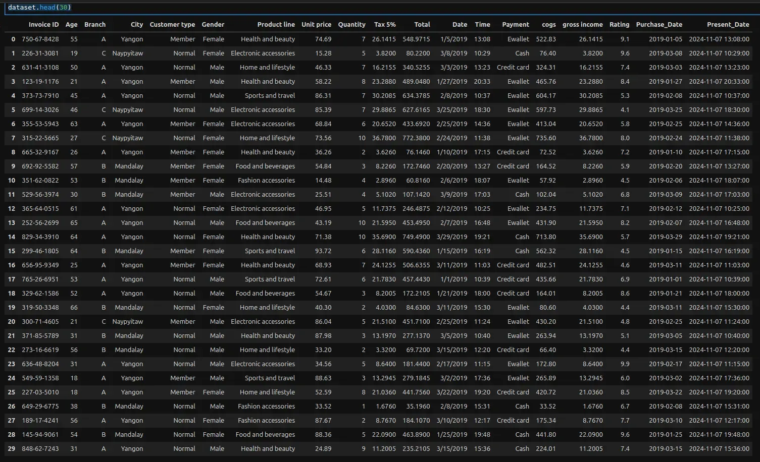
- As part of the ‘RFM Score’, we will first be calculating the Recency of Customer Purchases. This is done by calculating the difference between present day-date and purchase date from the dataset, as seen here in code.
### Calculating Recency

recency_data = pd.DataFrame()
recency_data['Invoice ID'] = dataset['Invoice ID']
recency_data['Recency'] = dataset['Present_Date'] - dataset['Purchase_Date']
recency_data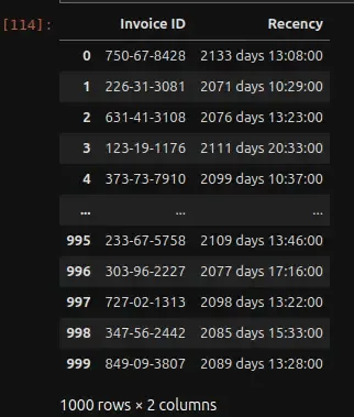
- Next, we will be calculating the Frequency of the number of purchases by each customer. In this dataset, each customer has just a single unique Invoice ID, hence we are setting it to one. In other cases, Frequency can be calculated by counting the number of purchases made by a customer.
### Calculating Frequency

frequency_data = pd.DataFrame()
frequency_data['Invoice ID'] = dataset['Invoice ID']
frequency_data['Frequency'] = 1
frequency_data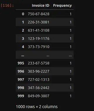
- Finally, we’ll be calculating the monetary value. This is basically the total amount spent by customers on the products.
## Calculating Monetary
monetary_data = pd.DataFrame()
monetary_data['Invoice ID'] = dataset['Invoice ID']
monetary_data['Monetary'] = dataset['Total']
monetary_data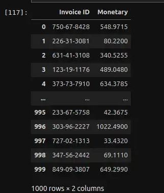
- To calculate the final RFM score, we will merge the above 3 factors.
### Merging all three dataframes into one

recency_frequency_data = recency_data.merge(frequency_data, on = 'Invoice ID')
R_F_M_data = recency_frequency_data.merge(monetary_data, on = 'Invoice ID')
merged_data = R_F_M_data.merge(dataset, on = 'Invoice ID')
merged_data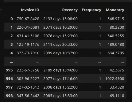
- Ranking all customers based on the Recency, Frequency, Monetary values and normalizing the values.
### Ranking Customer’s based upon their recency, frequency, and monetary score

merged_data['R_rank'] = merged_data['Recency'].rank(ascending = False)
merged_data['F_rank'] = merged_data['Frequency'].rank(ascending = True)
merged_data['M_rank'] = merged_data['Monetary'].rank(ascending = True)
### Normalizing the rank of the customers
merged_data['R_rank_norm'] = (merged_data['R_rank'] / merged_data['R_rank'].max())*100
merged_data['F_rank_norm'] = (merged_data['F_rank'] / merged_data['F_rank'].max())*100
merged_data['M_rank_norm'] = (merged_data['M_rank'] / merged_data['M_rank'].max())*100
merged_data.drop(columns = ['R_rank', 'F_rank', 'M_rank'], inplace = True)F-Rank here shown is 100, as the value we set was One for Frequency due to each customer making just one purchase in this dataset.
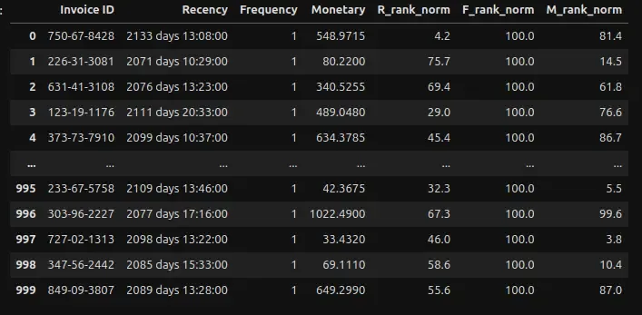
- Calculating the final RFM Score for each of the customers in the dataset and setting the score on a scale of 0 to 5. To calculate the RFM Score, we need to assign different weights (0 to 100%) based on which of the three factors are important for us. Here we have assigned 45% weightage to Recency, 50% weightage to Monetary and 5% to Frequency.
### Calculating RFM score

merged_data['RFM Score'] = 0.45 * merged_data['R_rank_norm'] + 0.05 * merged_data['F_rank_norm'] + 0.50 * merged_data['M_rank_norm']

### Scaling the RFM Score to a scale of 5

merged_data['RFM Score'] *= 0.05

### Fetching the final data

final_data = merged_data[['Invoice ID', 'RFM Score', 'Purchase_Date', 'Monetary', 'Rating', 'Customer type']]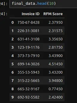
- Assigning Customer Segments as per the RFM Score and visualizing the customer segments in a pie chart.
-
RFM Score > 4.5 : Top Customer
-
4.5 > RFM Score > 4 : High Value Customer
-
4 > RFM Score > 3 : Medium value customer
-
3 > RFM Score > 1.6 : Low-value customer
-
RFM Score < 1.6 : Lost Customer
### Finding out the customer segment using the above scale

final_data["Customer Segment"] = np.where(final_data['RFM Score'] > 4.5, "Top Customers",
                                          (np.where(final_data['RFM Score'] > 4, "High value Customer",
                                                     (np.where(final_data['RFM Score'] > 3, "Medium Value Customer",
                                                               np.where(final_data['RFM Score'] > 1.6, 'Low Value Customers',
                                                                        'Lost Customers'))))))
final_data.head(30)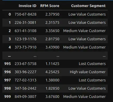
### Visualizing the customer segments

plt.figure(figsize = (6, 6))
plt.pie(final_data['Customer Segment'].value_counts(), labels = final_data['Customer Segment'].value_counts().index,
        autopct = '%.0f%%')
plt.title('Customer Segments based on RFM Score')
plt.show()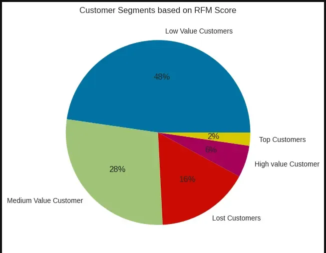
RFM Insights and Conclusions
-
Using the RFM Score we could determine different customer segments.
-
We see that 48% of the customers in this dataset had a score between 3/5 and 1.6/5, as low-value customers. The combination of this score is determined by the Recency of purchase and Monetary value spent.
-
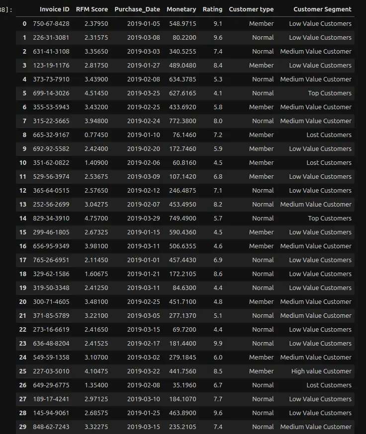
For example, for Invoice ID - 829-34-3910, its ranked as a Top Value customer with Amount spent of $749 on date 29th March.
-
Invoice ID - 351-62-0822, ranked as a Lost Customer with Amount spent $60, on date 6th Feb.
-
We can see from the below examples, how customer segments are created based on different factors. This data can be constantly updated without any manual effort. Based on incoming live data the status of a customer can also change based on latest purchasing trends.
Conclusion
Based on the above examples, we can conclude that K-Means Clustering and RFM Segmentation are two widely used techniques that offer valuable insights into customer behavior and preferences.
K-Means Clustering, an unsupervised learning algorithm, groups customers based on similarities in their attributes, such as demographics, purchase history, and browsing behavior.
This technique is particularly useful for identifying hidden patterns and uncovering previously unknown customer segments.
RFM Segmentation, on the other hand, focuses on three key metrics: Recency, Frequency, and Monetary value. By analyzing these metrics, businesses can identify their most valuable customers, those who have recently made purchases, frequently engage with the brand, and spend the most money. This segmentation approach helps prioritize marketing efforts and allocate resources effectively.
Customer segmentation is a vital strategy for businesses seeking to enhance their marketing effectiveness, improve customer satisfaction, and drive revenue growth.
By leveraging techniques like K-Means Clustering and RFM Segmentation, businesses can gain a competitive edge by understanding and catering to the unique needs and preferences of their diverse customer base.


