
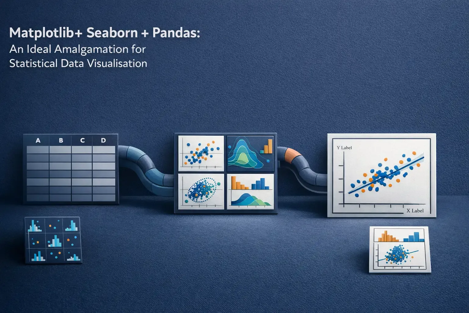
Matplotlib+ Seaborn + Pandas: An Ideal Amalgamation for Statistical Data Visualisation
Exploratory Data Analysis involves two fundamental steps
- Data Analysis (Data Pre processing, Cleaning and Manipulation).
- Data Visualisation (Visualise relationships in data using different types of plots).
Pandas is the most commonly used library for data analysis in python.
There are tons of libraries available in python for data visualisation and among them, matplotlib is the most commonly used. Matplotlib provides full control over the plot to make plot customisation easy, but what it lacks is built in support for pandas. Seaborn is a data visualisation library built on top of matplotlib and closely integrated with pandas.
This post would cover,
- Different types of plots available in seaborn.
- How the integration of pandas with seaborn helps in making complex multidimensional plots with minimal code?
- How to customise plots made using seaborn, with the help of matplotlib?
Who should read this---
slug: matplotlib-seaborn-pandas title: “Matplotlib+ Seaborn + Pandas: An Ideal Amalgamation for Statistical Data Visualisation” authors: [mit.desai2011] imgUrl: “/blogBanners/matplotlib.webp” publishedDate: “29 Sep 2019” tags: [Data Science, Seaborn, Data Visualization, Plotting]
Exploratory Data Analysis involves two fundamental steps
- Data Analysis (Data Pre processing, Cleaning and Manipulation).
- Data Visualisation (Visualise relationships in data using different types of plots).
Pandas is the most commonly used library for data analysis in python.
There are tons of libraries available in python for data visualisation and among them, matplotlib is the most commonly used. Matplotlib provides full control over the plot to make plot customisation easy, but what it lacks is built in support for pandas. Seaborn is a data visualisation library built on top of matplotlib and closely integrated with pandas.
This post would cover,
- Different types of plots available in seaborn.
- How the integration of pandas with seaborn helps in making complex multidimensional plots with minimal code?
- How to customise plots made using seaborn, with the help of matplotlib?
Who should read this post?
If you have working knowledge of matplotlib and pandas, and want to explore seaborn, this is a good place to start. If you are just starting with python, I would suggest to come back here after getting a basic idea about matplotlib and pandas.
1. Matplotlib
Although many tasks can be accomplished using just the seaborn functions, it is essential to understand the basics of matplotlib for two main reasons:
- Behind the scenes, seaborn uses matplotlib to draw the plots.
- Some customisation might require direct use of matplotlib.
Here is a quick review of matplotlib basics. The following figure shows the anatomy of a matplotlib Figure.
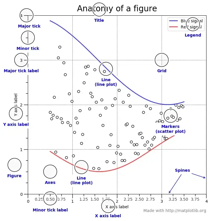
The three main classes to understand are Figure, Axes and Axis
Figure
It refers to the whole figure that you see. It is possible to have multiple sub-plots (Axes) in the same figure. In the above example, we have four sub-plots (Axes) in a single figure.
Axes
An Axes refers to the actual plot in the figure. A figure can have multiple Axes but a given Axes can be part of only one figure. In the above example, we have four Axes in one Figure
Axis
An Axis refers to an actual axis (x-axis/y-axis) in a specific plot.
Each example in the post assumes that the required modules and data set have been loaded as shown here
import pandas as pd
import numpy as np
from matplotlib import pyplot as plt
import seaborn as sns
tips = sns.load_dataset('tips')
iris = sns.load_dataset('iris')

tips.head()

    total_bill	tip	sex	smoker	day	time	size
0	16.99	1.01	Female	No	Sun	Dinner	2
1	10.34	1.66	Male	No	Sun	Dinner	3
2	21.01	3.50	Male	No	Sun	Dinner	3
3	23.68	3.31	Male	No	Sun	Dinner	2
4	24.59	3.61	Female	No	Sun	Dinner	4

iris.head()

    sepal_length	sepal_width	petal_length	petal_width	species
0	5.1	            3.5	        1.4	            0.2	        setosa
1	4.9	            3.0	        1.4	            0.2	        setosa
2	4.7	            3.2	        1.3	            0.2	        setosa
3	4.6	            3.1	        1.5	            0.2	        setosa
4	5.0	            3.6	        1.4	            0.2	        setosa
2.1.2 Specifying the axes to be used to make the plot
Each Axes-level function in seaborn takes an explicit ax argument. The Axes passed to the ax argument will be then used to make the plot. This provides great flexibility in terms of controlling which Axes is to be used for plotting.
For example, let’s say we want to look at the relationship between total bill and tip (using a scatter plot) as well as their distribution (using box plot) in the same figure but on different Axes.
dates = [
    '1981-01-01', '1981-01-02', '1981-01-03', '1981-01-04', '1981-01-05',
    '1981-01-06', '1981-01-07', '1981-01-08', '1981-01-09', '1981-01-10'
]
min_temperature = [20.7, 17.9, 18.8, 14.6, 15.8, 15.8, 15.8, 17.4, 21.8, 20.0]
max_temperature = [34.7, 28.9, 31.8, 25.6, 28.8, 21.8, 22.8, 28.4, 30.8, 32.0]

fig,axes = plt.subplots(nrows=1, ncols=1, figsize=(15,10))
axes.plot(dates, min_temperature, label='Min Temperature')
axes.plot(dates, max_temperature, label = 'Max Temperature')
axes.legend()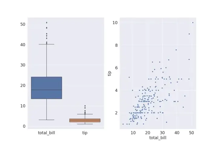
Each Axes-level function also returns the Axes on which the plot has been made. If an Axes has been passed to ax argument the same Axes object will be returned. The returned Axes object can then be used for further customisation using different methods like Axes.set_xlabel(), Axes.set_ylabel() etc
If no Axes is passed to the ax argument, seaborn uses the current (active) Axes to make the plot.
ig,curr_axes = plt.subplots()
scatter_plot_axes = sns.scatterplot(x='total_bill' y='tip', data=tips)
id(curr_axes) == id(scatter_plot_axes)
In the above example even though we haven’t explicitly passed curr*axes (currently active axes) to **_ax*** argument, seaborn still uses it to make the plot, since it is the currently active Axes.
id(curr_axes) == id(scatter_plot_axes) returns **True** indicating that they are the same Axes.
If no Axes is passed to ax argument and there is no currently active Axes object, seaborn creates a new Axes object to make the plot and then returns that Axes object
The Axes-level functions in seaborn do not have any direct parameter to control the figure size. However, since we can specify which Axes is to be used for plotting, by passing the Axes in ax argument, we can control the figure size as follows
fig,axes = plt.subplots(1, 1, figsize=(15,10))
sns.scatterplot(x='total_bill', y='tip', data=tips, ax=axes)
2.2 Figure Level Functions
When exploring a multi dimensional dataset, one of the most common use case for data visualisation, is drawing multiple instances of same plot on different subsets of data. The figure-level functions in seaborn are tailor made for this use case. A figure-level function has complete control over the entire figure and each time a figure level function is called, it creates a new figure which can include multiple Axes, all organised in a meaningful way. The three most generic figure-level functions in seaborn are FacetGrid, PairGrid, JointGrid
2.2.1 FacetGrid
Consider a following use case, we want to visualise the relationship between total bill and tip (via a scatter plot) on different subsets of data. Each subset of data is categorised by a unique combination of values for following variables
1. day (Thur, Fri Sat, Sun)
2. smoker (whether the person is a smoker or not)
3. sex (male or female)
This can easily be done in matplotlib as follows
row_variable = 'day'
col_variable = 'smoker'
hue_variable = 'sex'
row_variables = tips[row_variable].unique()
col_variables = tips[col_variable].unique()
num_rows = row_variables.shape[0]
num_cols = col_variables.shape[0]

fig,axes = plt.subplots(num_rows, num_cols, sharex=True, sharey=True, figsize=(15,10))
subset = tips.groupby([row_variable,col_variable])
for row in range(num_rows):
    for col in range(num_cols):
        ax = axes[row][col]
        row_id = row_variables[row]
        col_id = col_variables[col]
        ax_data = subset.get_group((row_id, col_id))
        sns.scatterplot(x='total_bill', y='tip', data=ax_data, hue=hue_variable,ax=ax)
        title = row_variable + ' : '  + row_id + ' ' + col_variable + ' : ' + col_id
        ax.set_title(title)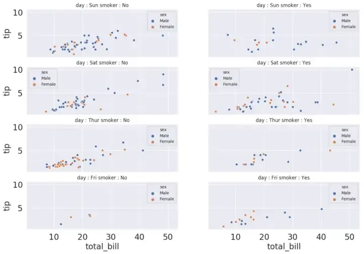
The above code can be broken down into three steps:
- Create an Axes (subplot) for each subset of data
- Divide the dataset into subsets
- On each Axes, draw the scatter plot using subset of data
corresponding to that Axes
Step 1 can be done in seaborn using FacetGrid()
Step 2 and Step 3 can be done using FacetGrid.map()
Using FacetGrid, we can create Axes for dividing the dataset upto three dimensions using row, col and hue parameters.
Once we have created a FacetGrid, we can plot the same kind of plot on all Axes using FacetGrid.map() by passing the type of plot as an argument. We also need to pass the name of columns to be used for plotting.
facet_grid = sns.FacetGrid(row='day', col='smoker', hue='sex', data=tips, height=4, aspect=1.5)
facet_grid.map(sns.scatterplot, 'total_bill','tip')
facet_grid.add_legend()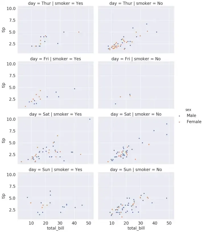
Thus “Matplotlib offers good support to make plots with multiple Axes but seaborn builds on top of it by directly linking the structure of plot with the structure of dataset”. Using FacetGrid, we neither have to explicitly create Axes for each subset nor do we have to explicitly divide the data into subsets. That is done internally by FacetGrid() and FacetGrid.map() respectively.
We can pass different Axes level function to FacetGrid.map().
Also, seaborn provides three Figure-Level functions (high level interfaces) which use FacetGrid() and FacetGrid.map() in the background.
1. relplot()
2. catplot()
3. lmplot()
Each of the above figure level function use FacetGrid() to create multiple Axes, and take an Axes-level function in kind argument, which is then passed to FacetGrid.map() internally. So the above three functions are different in terms of what Axes-level functions can be passed to each one of them.
relplot() - FacetGrid() + lineplot() / scatterplot() catplot() - FacetGrid() +
stripplot() / swarmplot() / boxplot() boxenplot() / violinplot() / pointplot()
barplot() / countplot() lmplot() - FacetGrid() + regplot()4
Explicitly using FacetGrid provides more flexibility than directly using high level interfaces like relplot(), catplot() or lmplot(); for example, with FacetGrid(), we can also pass custom functions to FacetGrid.map() but with high level interfaces you can use only the built in Axes-level functions in kind argument. If you do not need that flexibility, you can directly use the high level interfaces
grid = sns.relplot(x='total_bill', y='tip', row='day', col='smoker', hue='sex', data=tips, kind='scatter', height=4, aspect=1.5)
grid = sns.catplot(x='sex', y='total_bill', col='day', col_wrap=2, hue='smoker', data=tips, kind='box', height=4, aspect=1.5)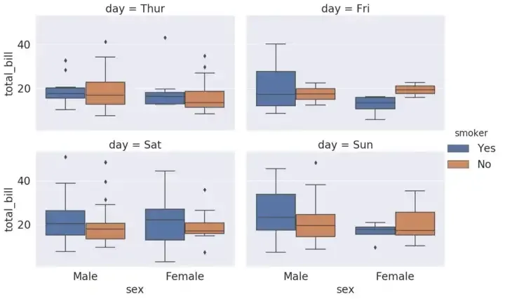
grid = sns.lmplot(x='total_bill', y='tip', col='day', col_wrap=3, hue='sex', data=tips)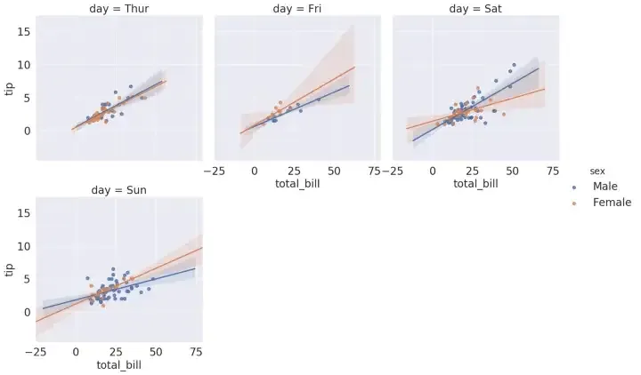
Each of the above three figure level functions as well as FacetGrid returns an instance of FacetGrid. Using FacetGrid instance, we can get access to individual Axes which can then be used to tweak the plot (like adding axis labels, titles etc). Also, controlling the size of figure level functions is different compared to controlling the size of matplotlib figures. Instead of setting the overall figure size, we can set the height and aspect of each Facet (subplot) using the height and aspect parameters.
facet_grid = sns.FacetGrid(row='day', col='smoker', hue='sex', data=tips, height=4, aspect=1.5)
facet_grid = facet_grid.map(plt.scatter, 'total_bill','tip')
facet_grid = facet_grid.add_legend()
all_axes = facet_grid.axes
for ax in all_axes.flatten():
    ax.set_xticks(np.arange(0,55,5))
    ax.tick_params('x', labelrotation=45)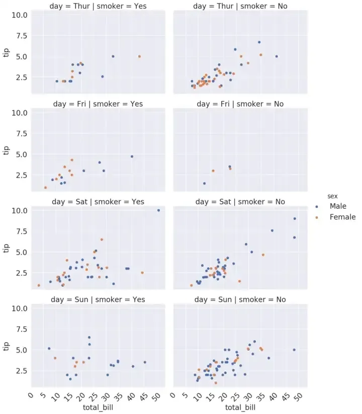
Refer FacetGrid for more examples.
2.2.2 PairGrid
PairGrid is used to plot pairwise relationships between variables in a dataset. Each subplot shows a relationship between a pair of variables. Consider a following use case, we want to visualise relationship (via scatter plot) between every pair of variables. This can be easily done in matplotlib as follows
row_variables = iris.columns[:-1]
column_variables = iris.columns[:-1]
num_rows = row_variables.shape[0]
num_columns = column_variables.shape[0]
fig,axes = plt.subplots(num_rows, num_columns, sharey=True)
for i in range(num_rows):
    for j in range(num_columns):
        ax = axes[i][j]
        row_variable = row_variables[i]
        column_variable = column_variables[j]
        sns.scatterplot(x=column_variable, y=row_variable, data=iris, ax=ax)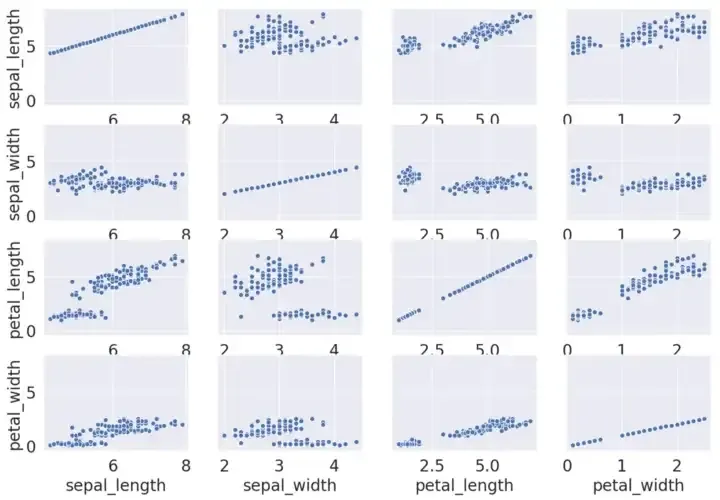
The above code can be broken down into two steps
- Create an Axes for each pair of variables
- On each Axes, draw the scatter plot using the data
corresponding to that pair of variables
Step 1 can be done using PairGrid()
Step 2 can be done using PairGrid.map() .
Thus PairGrid() creates Axes for each pair of variables and PairGrid.map() draws the plot on each Axes using data corresponding to that pair of variables. We can pass different Axes-level function to PairGrid.map()
pairgrid = sns.PairGrid(data=iris) pairgrid = pairgrid.map(sns.scatterplot)
It does not make sense to plot a scatter plot on the diagonal Axes. It is possible to plot one kind of plot on diagonal Axes and another kind of plot on non-diagonal Axes.
pairgrid = sns.PairGrid(data=iris)
pairgrid = pairgrid.map_offdiag(sns.scatterplot)
pairgrid = pairgrid.map_diag(plt.hist)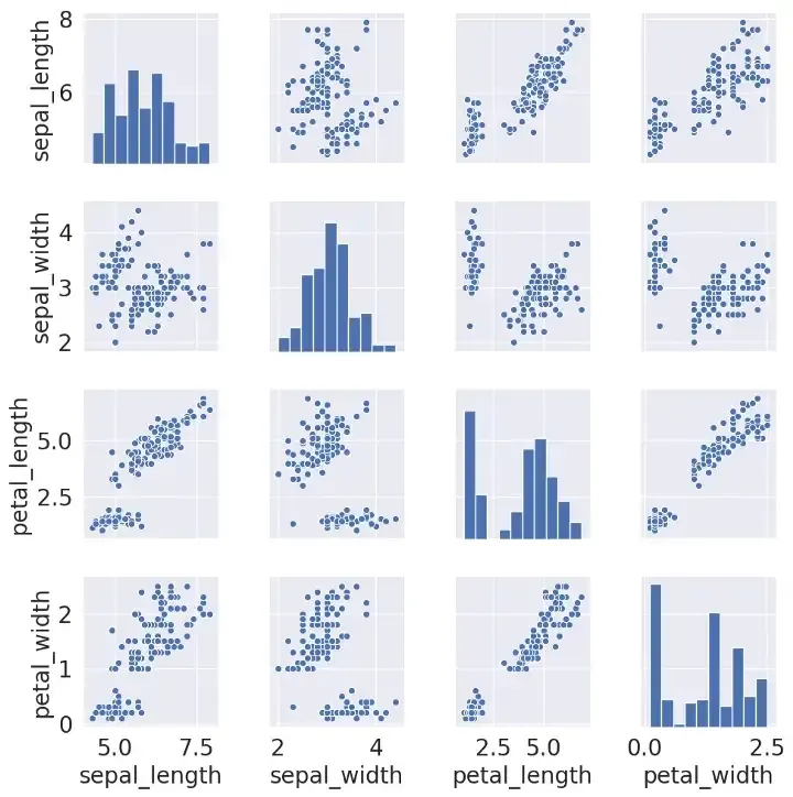
It is also possible to draw different kind of plots on Upper Triangular Axes, Diagonal Axes and Lower Triangular Axes.
pairgrid = sns.PairGrid(data=iris)
pairgrid = pairgrid.map_upper(sns.scatterplot)
pairgrid = pairgrid.map_diag(plt.hist)
pairgrid = pairgrid.map_lower(sns.kdeplot)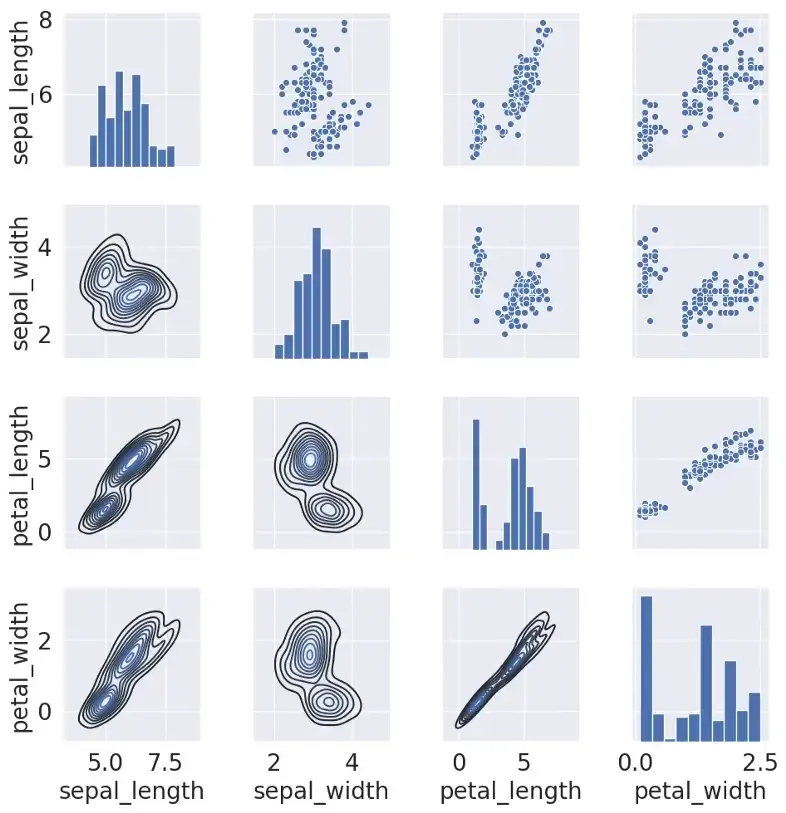
Seaborn also provides a high level interface pairplot() to plot pairwise relationships of variables if you don’t need all the flexibility of PairGrid(). It uses PairGrid() and PairGrid.map() in the background.
sns.pairplot(data=iris)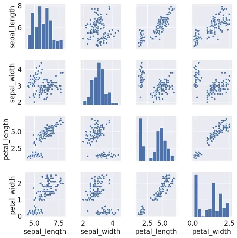
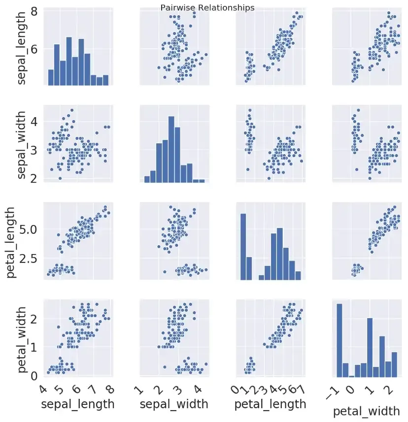
Both PairGrid() and PairPlot() return an instance of PairGrid(). Using PairGrid() instance, we can get access to individual Axes which can then be used to tweak plot like adding axis labels, titles etc
pairgrid = sns.PairGrid(data=iris)
pairgrid = pairgrid.map_offdiag(sns.scatterplot)
pairgrid = pairgrid.map_diag(plt.hist)
all_axes = pairgrid.axes
fig = pairgrid.fig
fig.suptitle('Pairwise Relationships')
for ax in all_axes.flatten():
    xmin, xmax = ax.get_xlim()
    xmin = np.floor(xmin)
    xmax = np.ceil(xmax)
    xticks = np.arange(xmin, xmax, 1)
    ax.set_xticks(xticks)
    ax.tick_params('x', labelrotation=45)
Refer PairGrid for more examples
2.2.3 JointGrid
JointGrid is used when we want to plot a bi-variate distribution along with marginal distributions in the same plot. Joint Distribution of two variables can be visualised using scatter plot/regplot or kdeplot. Marginal Distribution of variables can be visualised by histograms and/or kde plot. The Axes-level function to use for joint distribution must be passed to JointGrid.plot_joint(). The Axes-level function to use for marginal distribution must be passed to JointGrid.plot_marginals()
jointgrid = sns.JointGrid(x='total_bill', y='tip', data=tips)
jointgrid.plot_joint(sns.scatterplot)
jointgrid.plot_marginals(sns.distplot)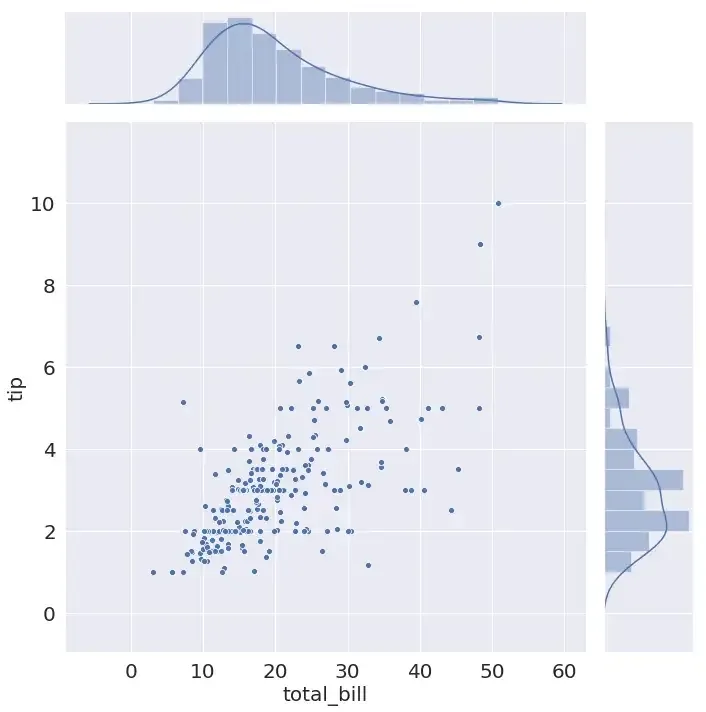
If you don’t need all the flexibility of JointGrid(), seaborn also provides a high level interface jointplot() to plot bi-variate distribution along with marginal distributions. It uses JointGrid() and JointGrid.plot_joint() in the background.
sns.jointplot(x='total_bill', y='tip', data=tips, height=10)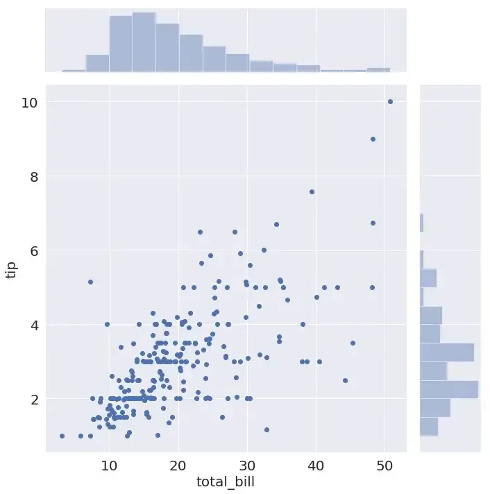
Both JointGrid() and jointplot() return an instance of JointGrid(). Using JointGrid() instance, we can get access to individual Axes which can then be used to tweak plots like adding labels, title etc
jointgrid = sns.JointGrid(x='total_bill', y='tip', data=tips)
jointgrid.plot_joint(sns.scatterplot)
jointgrid.plot_marginals(sns.kdeplot)
jointgrid.ax_marg_x.set_title('Marginal Distribution: total_bill')
jointgrid.ax_marg_y.set_title('Marginal Distribution: tip')
jointgrid.ax_joint.set_xticks(np.arange(-10,80,10))
jointgrid.ax_joint.tick_params('x', labelrotation=45)
Refer JointGrid for more examples
Summary
Integration of seaborn with pandas helps in making complex multidimensional plots with minimal code. Each plotting function in seaborn is either an Axes-level function or a figure-level function. An Axes-level function draws onto a single matplotlib Axes and does not effect the rest of the figure. A figure-level function, on the other hand, controls the entire figure. post?
If you have working knowledge of matplotlib and pandas, and want to explore seaborn, this is a good place to start. If you are just starting with python, I would suggest to come back here after getting a basic idea about matplotlib and pandas.
1. Matplotlib
Although many tasks can be accomplished using just the seaborn functions, it is essential to understand the basics of matplotlib for two main reasons:
- Behind the scenes, seaborn uses matplotlib to draw the plots.
- Some customisation might require direct use of matplotlib.
Here is a quick review of matplotlib basics. The following figure shows the anatomy of a matplotlib Figure.
The three main classes to understand are Figure, Axes and Axis
Figure
It refers to the whole figure that you see. It is possible to have multiple sub-plots (Axes) in the same figure. In the above example, we have four sub-plots (Axes) in a single figure.
Axes
An Axes refers to the actual plot in the figure. A figure can have multiple Axes but a given Axes can be part of only one figure. In the above example, we have four Axes in one Figure
Axis
An Axis refers to an actual axis (x-axis/y-axis) in a specific plot.
Each example in the post assumes that the required modules and data set have been loaded as shown here
import pandas as pd
import numpy as np
from matplotlib import pyplot as plt
import seaborn as sns
tips = sns.load_dataset('tips')
iris = sns.load_dataset('iris')

tips.head()

    total_bill	tip	sex	smoker	day	time	size
0	16.99	1.01	Female	No	Sun	Dinner	2
1	10.34	1.66	Male	No	Sun	Dinner	3
2	21.01	3.50	Male	No	Sun	Dinner	3
3	23.68	3.31	Male	No	Sun	Dinner	2
4	24.59	3.61	Female	No	Sun	Dinner	4

iris.head()

    sepal_length	sepal_width	petal_length	petal_width	species
0	5.1	            3.5	        1.4	            0.2	        setosa
1	4.9	            3.0	        1.4	            0.2	        setosa
2	4.7	            3.2	        1.3	            0.2	        setosa
3	4.6	            3.1	        1.5	            0.2	        setosa
4	5.0	            3.6	        1.4	            0.2	        setosa
2.1.2 Specifying the axes to be used to make the plot
Each Axes-level function in seaborn takes an explicit ax argument. The Axes passed to the ax argument will be then used to make the plot. This provides great flexibility in terms of controlling which Axes is to be used for plotting.
For example, let’s say we want to look at the relationship between total bill and tip (using a scatter plot) as well as their distribution (using box plot) in the same figure but on different Axes.
dates = [
    '1981-01-01', '1981-01-02', '1981-01-03', '1981-01-04', '1981-01-05',
    '1981-01-06', '1981-01-07', '1981-01-08', '1981-01-09', '1981-01-10'
]
min_temperature = [20.7, 17.9, 18.8, 14.6, 15.8, 15.8, 15.8, 17.4, 21.8, 20.0]
max_temperature = [34.7, 28.9, 31.8, 25.6, 28.8, 21.8, 22.8, 28.4, 30.8, 32.0]

fig,axes = plt.subplots(nrows=1, ncols=1, figsize=(15,10))
axes.plot(dates, min_temperature, label='Min Temperature')
axes.plot(dates, max_temperature, label = 'Max Temperature')
axes.legend()
Each Axes-level function also returns the Axes on which the plot has been made. If an Axes has been passed to ax argument the same Axes object will be returned. The returned Axes object can then be used for further customisation using different methods like Axes.set_xlabel(), Axes.set_ylabel() etc
If no Axes is passed to the ax argument, seaborn uses the current (active) Axes to make the plot.
ig,curr_axes = plt.subplots()
scatter_plot_axes = sns.scatterplot(x='total_bill' y='tip', data=tips)
id(curr_axes) == id(scatter_plot_axes)
In the above example even though we haven’t explicitly passed curr*axes (currently active axes) to **_ax*** argument, seaborn still uses it to make the plot, since it is the currently active Axes.
id(curr_axes) == id(scatter_plot_axes) returns **True** indicating that they are the same Axes.
If no Axes is passed to ax argument and there is no currently active Axes object, seaborn creates a new Axes object to make the plot and then returns that Axes object
The Axes-level functions in seaborn do not have any direct parameter to control the figure size. However, since we can specify which Axes is to be used for plotting, by passing the Axes in ax argument, we can control the figure size as follows
fig,axes = plt.subplots(1, 1, figsize=(15,10))
sns.scatterplot(x='total_bill', y='tip', data=tips, ax=axes)
2.2 Figure Level Functions
When exploring a multi dimensional dataset, one of the most common use case for data visualisation, is drawing multiple instances of same plot on different subsets of data. The figure-level functions in seaborn are tailor made for this use case. A figure-level function has complete control over the entire figure and each time a figure level function is called, it creates a new figure which can include multiple Axes, all organised in a meaningful way. The three most generic figure-level functions in seaborn are FacetGrid, PairGrid, JointGrid
2.2.1 FacetGrid
Consider a following use case, we want to visualise the relationship between total bill and tip (via a scatter plot) on different subsets of data. Each subset of data is categorised by a unique combination of values for following variables
1. day (Thur, Fri Sat, Sun)
2. smoker (whether the person is a smoker or not)
3. sex (male or female)
This can easily be done in matplotlib as follows
row_variable = 'day'
col_variable = 'smoker'
hue_variable = 'sex'
row_variables = tips[row_variable].unique()
col_variables = tips[col_variable].unique()
num_rows = row_variables.shape[0]
num_cols = col_variables.shape[0]

fig,axes = plt.subplots(num_rows, num_cols, sharex=True, sharey=True, figsize=(15,10))
subset = tips.groupby([row_variable,col_variable])
for row in range(num_rows):
    for col in range(num_cols):
        ax = axes[row][col]
        row_id = row_variables[row]
        col_id = col_variables[col]
        ax_data = subset.get_group((row_id, col_id))
        sns.scatterplot(x='total_bill', y='tip', data=ax_data, hue=hue_variable,ax=ax)
        title = row_variable + ' : '  + row_id + ' ' + col_variable + ' : ' + col_id
        ax.set_title(title)
The above code can be broken down into three steps:
- Create an Axes (subplot) for each subset of data
- Divide the dataset into subsets
- On each Axes, draw the scatter plot using subset of data
corresponding to that Axes
Step 1 can be done in seaborn using FacetGrid()
Step 2 and Step 3 can be done using FacetGrid.map()
Using FacetGrid, we can create Axes for dividing the dataset upto three dimensions using row, col and hue parameters.
Once we have created a FacetGrid, we can plot the same kind of plot on all Axes using FacetGrid.map() by passing the type of plot as an argument. We also need to pass the name of columns to be used for plotting.
facet_grid = sns.FacetGrid(row='day', col='smoker', hue='sex', data=tips, height=4, aspect=1.5)
facet_grid.map(sns.scatterplot, 'total_bill','tip')
facet_grid.add_legend()
Thus “Matplotlib offers good support to make plots with multiple Axes but seaborn builds on top of it by directly linking the structure of plot with the structure of dataset”. Using FacetGrid, we neither have to explicitly create Axes for each subset nor do we have to explicitly divide the data into subsets. That is done internally by FacetGrid() and FacetGrid.map() respectively.
We can pass different Axes level function to FacetGrid.map().
Also, seaborn provides three Figure-Level functions (high level interfaces) which use FacetGrid() and FacetGrid.map() in the background.
1. relplot()
2. catplot()
3. lmplot()
Each of the above figure level function use FacetGrid() to create multiple Axes, and take an Axes-level function in kind argument, which is then passed to FacetGrid.map() internally. So the above three functions are different in terms of what Axes-level functions can be passed to each one of them.
relplot() - FacetGrid() + lineplot() / scatterplot() catplot() - FacetGrid() +
stripplot() / swarmplot() / boxplot() boxenplot() / violinplot() / pointplot()
barplot() / countplot() lmplot() - FacetGrid() + regplot()4
Explicitly using FacetGrid provides more flexibility than directly using high level interfaces like relplot(), catplot() or lmplot(); for example, with FacetGrid(), we can also pass custom functions to FacetGrid.map() but with high level interfaces you can use only the built in Axes-level functions in kind argument. If you do not need that flexibility, you can directly use the high level interfaces
grid = sns.relplot(x='total_bill', y='tip', row='day', col='smoker', hue='sex', data=tips, kind='scatter', height=4, aspect=1.5)
grid = sns.catplot(x='sex', y='total_bill', col='day', col_wrap=2, hue='smoker', data=tips, kind='box', height=4, aspect=1.5)
grid = sns.lmplot(x='total_bill', y='tip', col='day', col_wrap=3, hue='sex', data=tips)
Each of the above three figure level functions as well as FacetGrid returns an instance of FacetGrid. Using FacetGrid instance, we can get access to individual Axes which can then be used to tweak the plot (like adding axis labels, titles etc). Also, controlling the size of figure level functions is different compared to controlling the size of matplotlib figures. Instead of setting the overall figure size, we can set the height and aspect of each Facet (subplot) using the height and aspect parameters.
facet_grid = sns.FacetGrid(row='day', col='smoker', hue='sex', data=tips, height=4, aspect=1.5)
facet_grid = facet_grid.map(plt.scatter, 'total_bill','tip')
facet_grid = facet_grid.add_legend()
all_axes = facet_grid.axes
for ax in all_axes.flatten():
    ax.set_xticks(np.arange(0,55,5))
    ax.tick_params('x', labelrotation=45)
Refer FacetGrid for more examples.
2.2.2 PairGrid
PairGrid is used to plot pairwise relationships between variables in a dataset. Each subplot shows a relationship between a pair of variables. Consider a following use case, we want to visualise relationship (via scatter plot) between every pair of variables. This can be easily done in matplotlib as follows
row_variables = iris.columns[:-1]
column_variables = iris.columns[:-1]
num_rows = row_variables.shape[0]
num_columns = column_variables.shape[0]
fig,axes = plt.subplots(num_rows, num_columns, sharey=True)
for i in range(num_rows):
    for j in range(num_columns):
        ax = axes[i][j]
        row_variable = row_variables[i]
        column_variable = column_variables[j]
        sns.scatterplot(x=column_variable, y=row_variable, data=iris, ax=ax)
The above code can be broken down into two steps
- Create an Axes for each pair of variables
- On each Axes, draw the scatter plot using the data
corresponding to that pair of variables
Step 1 can be done using PairGrid()
Step 2 can be done using PairGrid.map() .
Thus PairGrid() creates Axes for each pair of variables and PairGrid.map() draws the plot on each Axes using data corresponding to that pair of variables. We can pass different Axes-level function to PairGrid.map()
pairgrid = sns.PairGrid(data=iris) pairgrid = pairgrid.map(sns.scatterplot)
It does not make sense to plot a scatter plot on the diagonal Axes. It is possible to plot one kind of plot on diagonal Axes and another kind of plot on non-diagonal Axes.
pairgrid = sns.PairGrid(data=iris)
pairgrid = pairgrid.map_offdiag(sns.scatterplot)
pairgrid = pairgrid.map_diag(plt.hist)
It is also possible to draw different kind of plots on Upper Triangular Axes, Diagonal Axes and Lower Triangular Axes.
pairgrid = sns.PairGrid(data=iris)
pairgrid = pairgrid.map_upper(sns.scatterplot)
pairgrid = pairgrid.map_diag(plt.hist)
pairgrid = pairgrid.map_lower(sns.kdeplot)
Seaborn also provides a high level interface pairplot() to plot pairwise relationships of variables if you don’t need all the flexibility of PairGrid(). It uses PairGrid() and PairGrid.map() in the background.
sns.pairplot(data=iris)
Both PairGrid() and PairPlot() return an instance of PairGrid(). Using PairGrid() instance, we can get access to individual Axes which can then be used to tweak plot like adding axis labels, titles etc
pairgrid = sns.PairGrid(data=iris)
pairgrid = pairgrid.map_offdiag(sns.scatterplot)
pairgrid = pairgrid.map_diag(plt.hist)
all_axes = pairgrid.axes
fig = pairgrid.fig
fig.suptitle('Pairwise Relationships')
for ax in all_axes.flatten():
    xmin, xmax = ax.get_xlim()
    xmin = np.floor(xmin)
    xmax = np.ceil(xmax)
    xticks = np.arange(xmin, xmax, 1)
    ax.set_xticks(xticks)
    ax.tick_params('x', labelrotation=45)
Refer PairGrid for more examples
2.2.3 JointGrid
JointGrid is used when we want to plot a bi-variate distribution along with marginal distributions in the same plot. Joint Distribution of two variables can be visualised using scatter plot/regplot or kdeplot. Marginal Distribution of variables can be visualised by histograms and/or kde plot. The Axes-level function to use for joint distribution must be passed to JointGrid.plot_joint(). The Axes-level function to use for marginal distribution must be passed to JointGrid.plot_marginals()
jointgrid = sns.JointGrid(x='total_bill', y='tip', data=tips)
jointgrid.plot_joint(sns.scatterplot)
jointgrid.plot_marginals(sns.distplot)
If you don’t need all the flexibility of JointGrid(), seaborn also provides a high level interface jointplot() to plot bi-variate distribution along with marginal distributions. It uses JointGrid() and JointGrid.plot_joint() in the background.
sns.jointplot(x='total_bill', y='tip', data=tips, height=10)
Both JointGrid() and jointplot() return an instance of JointGrid(). Using JointGrid() instance, we can get access to individual Axes which can then be used to tweak plots like adding labels, title etc
jointgrid = sns.JointGrid(x='total_bill', y='tip', data=tips)
jointgrid.plot_joint(sns.scatterplot)
jointgrid.plot_marginals(sns.kdeplot)
jointgrid.ax_marg_x.set_title('Marginal Distribution: total_bill')
jointgrid.ax_marg_y.set_title('Marginal Distribution: tip')
jointgrid.ax_joint.set_xticks(np.arange(-10,80,10))
jointgrid.ax_joint.tick_params('x', labelrotation=45)
Refer JointGrid for more examples
Summary
Integration of seaborn with pandas helps in making complex multidimensional plots with minimal code. Each plotting function in seaborn is either an Axes-level function or a figure-level function. An Axes-level function draws onto a single matplotlib Axes and does not effect the rest of the figure. A figure-level function, on the other hand, controls the entire figure.


